
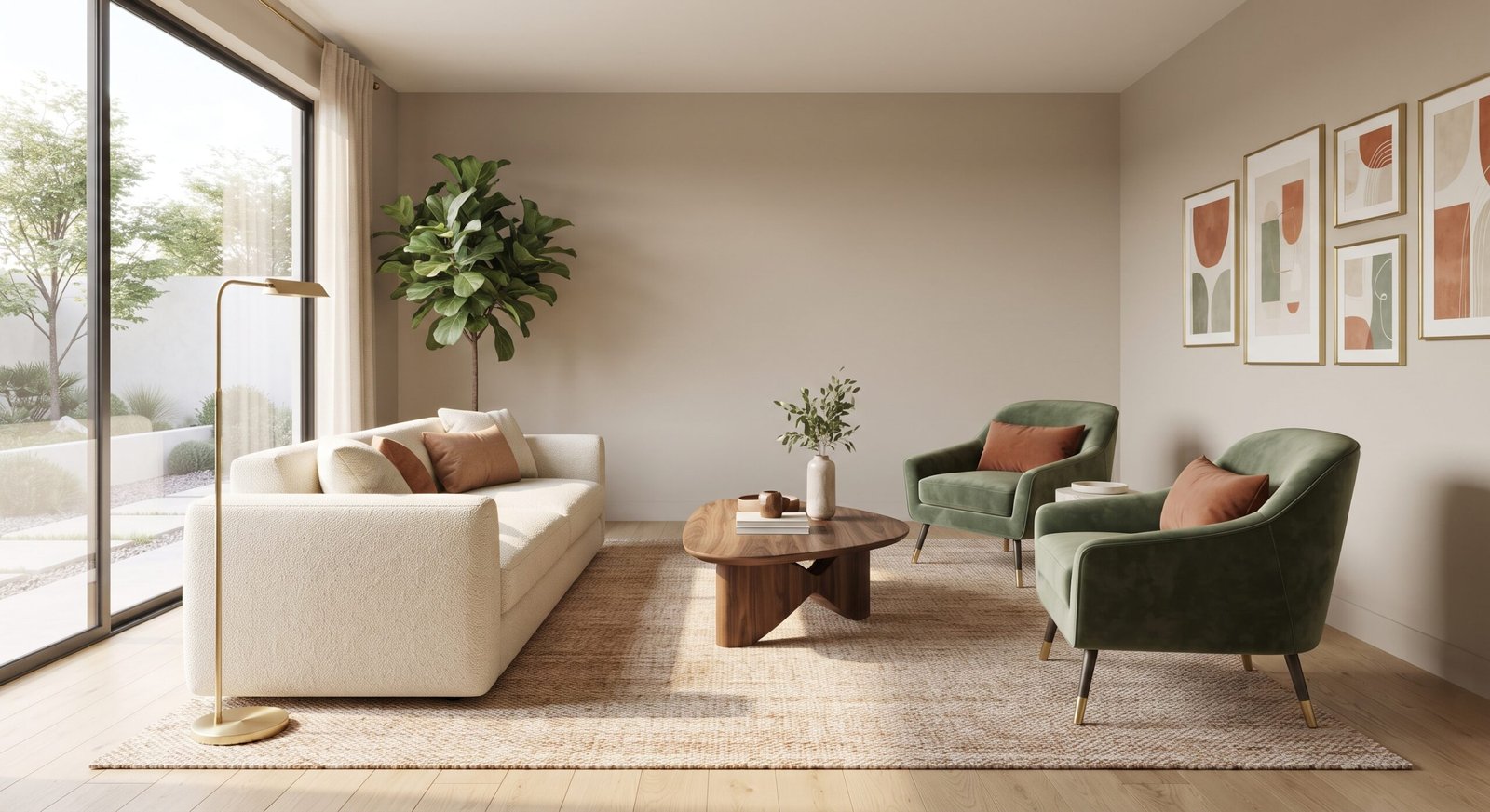
Color is the silent director of your home’s atmosphere. Long before anyone notices the architecture or the specific furniture brands, the eye registers color. Developing cohesive color palettes is arguably the single most impactful step in interior design, transforming stark rooms into harmonious, emotionally resonant living spaces.
However, choosing paint swatches and fabric hues can feel overwhelming when faced with thousands of options. Successful decorating requires more than just picking your favorite colors; it demands a strategic understanding of color theory, lighting, and balance. In this comprehensive guide, we will break down how to design, test, and implement stunning color palettes that elevate your home’s aesthetic.
Key Takeaways
- Follow the 60-30-10 Rule: Allocate 60% of the room to a dominant neutral color, 30% to a secondary color, and 10% to an accent pop.
- Consider Natural Light: South-facing rooms amplify warm tones, while north-facing rooms cast a cooler, bluer light that can make grays and blues look stark.
- Establish Flow: Ensure adjacent rooms share subtle undertones to create visual continuity throughout your home.
- Test Before You Paint: Always paint large sample boards and observe them at different times of the day before committing to a full wall.
1. Understanding Color Theory and Psychological Impact
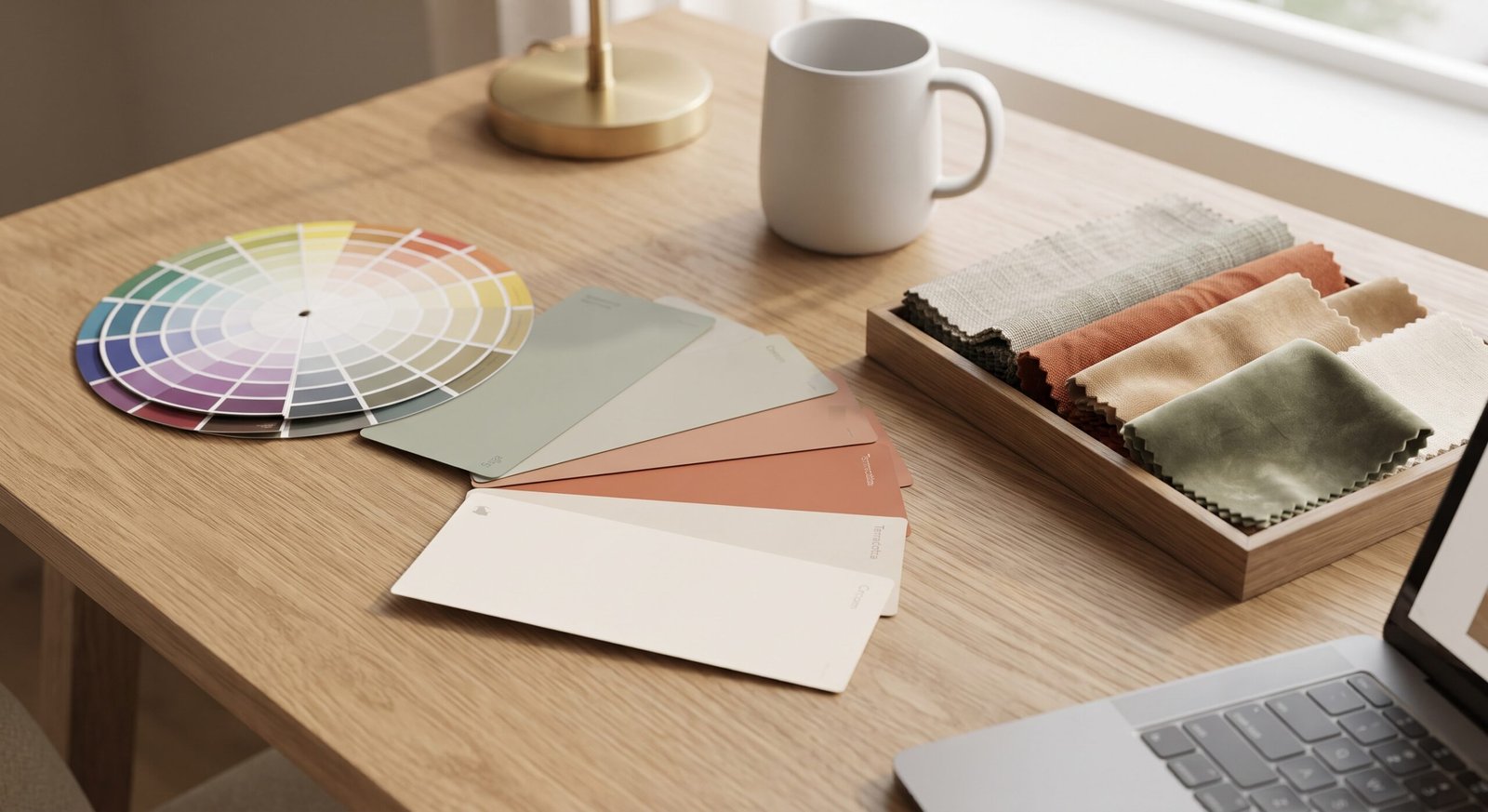
Every hue carries a distinct emotional weight and psychological effect. When designing color palettes, understanding how colors interact on the color wheel helps you avoid clashing combinations and achieve deliberate moods.
- Warm Tones (Reds, Oranges, Yellows): Stimulate conversation, energy, and appetite, making them ideal for living rooms and dining spaces.
- Cool Tones (Blues, Greens, Purples): Promote calm, focus, and relaxation, perfect for bedrooms and home offices.
- Neutrals (Beiges, Grays, Whites): Provide a versatile, timeless background that lets texture and art take center stage.
“Color is not merely a coat of paint; it is the emotional heartbeat of your interior design scheme.”
2. Proven Interior Color Formulas
To simplify your design process, interior designers rely on specific color relationship models. The table below outlines the most popular structural frameworks for home color palettes:
| Palette Type | Color Relationship | Best Suited For |
| Monochromatic | Varied shades and tints of a single color | Modern, minimalist, and serene bedrooms |
| Analogous | Colors sitting side-by-side on the wheel (e.g., blue, teal, green) | Cozy living rooms seeking natural harmony |
| Complementary | Colors sitting opposite each other (e.g., blue and orange) | Vibrant, high-contrast entryways or accent walls |
| Neutral with a Pop | Full neutral base with one bold accent hue | Versatile, easily updatable family spaces |
3. How Lighting Affects Your Color Choices
A paint color never looks the same in a showroom as it does on your living room wall. Lighting is the ultimate variable when evaluating color palettes.
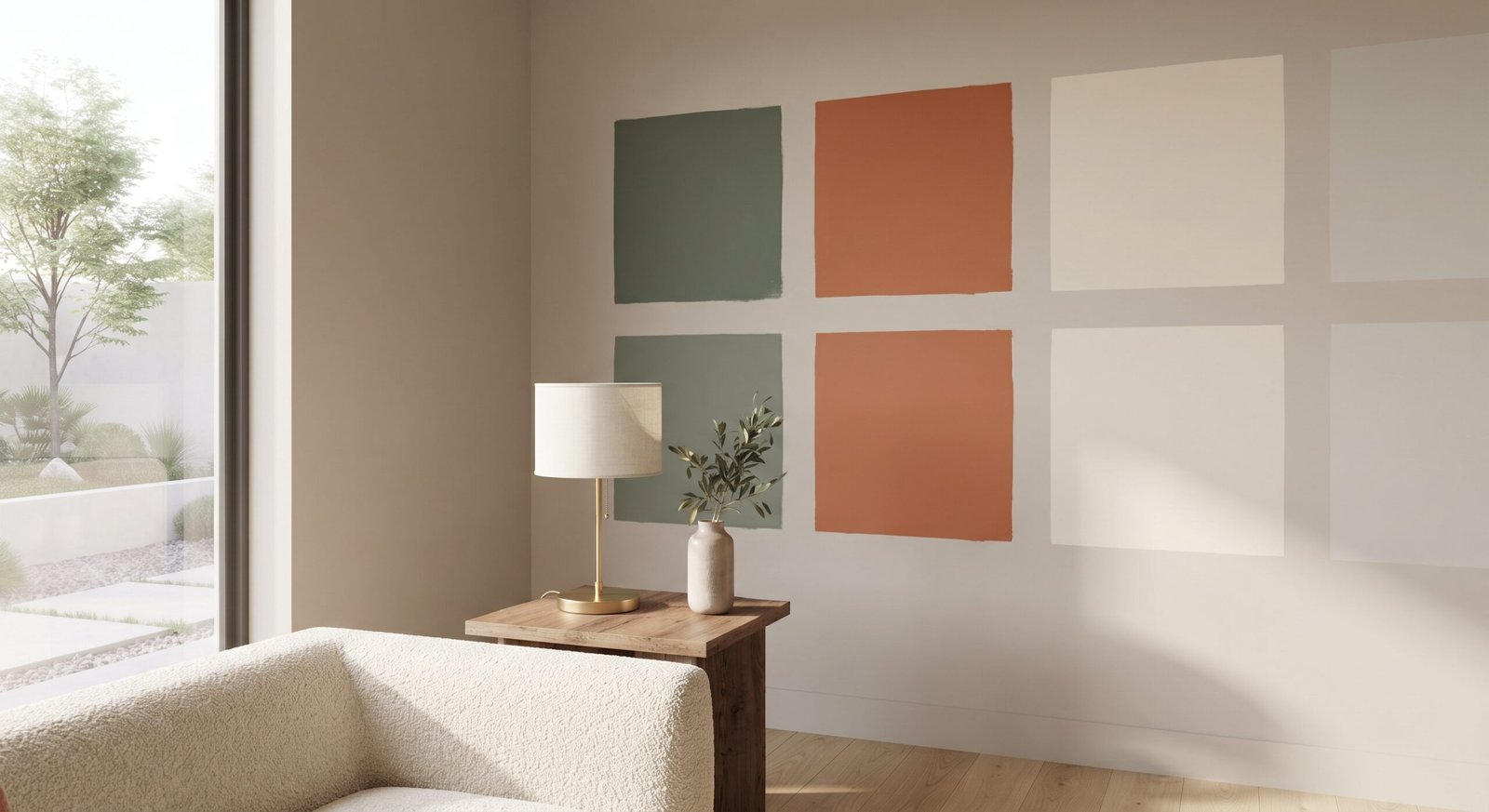
Always evaluate paint samples against different lighting conditions:
- Morning Light: Tends to be crisp and blue, brightening cool tones.
- Evening Light: Introduces golden and amber hues, warming up whites and grays.
- Artificial Lighting: Incandescent bulbs emit warm yellow light, while LEDs can skew cool or daylight depending on the Kelvin rating you choose.
4. Applying Your Palette Across Surfaces
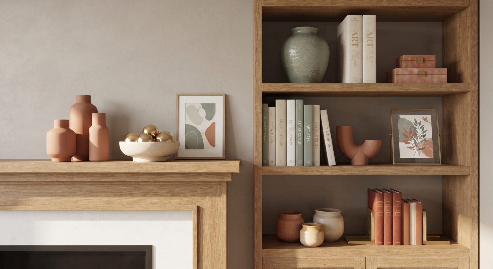
Once your palette is locked in, distribute the colors intentionally throughout the room. Your dominant neutral covers the largest surfaces (walls and large rugs), your secondary color handles furniture and drapery, and your accent color shines through smaller accessories like pillows, art, and ceramics.
Conclusion
Mastering color palettes allows you to transform ordinary rooms into personalized, highly professional sanctuaries. By balancing light, understanding color theory, and applying the 60-30-10 rule, you can create cohesive spaces that feel both intentional and deeply inviting.
Frequently Asked Questions
How do I choose a cohesive color palette for my entire house?
Start by selecting a primary neutral color that flows through your main hallway and common areas. Then, allow each individual room to feature unique secondary and accent colors that share similar undertones (either all warm or all cool) to maintain a unified transition from room to room.
What is the 60-30-10 rule in interior design?
It is a classic decorating guideline where 60% of the room is your dominant color (usually walls), 30% is your secondary color (upholstery, curtains, large rugs), and 10% is your accent color (throw pillows, artwork, accessories).
How can I make a small room feel bigger using color?
Opt for light, reflective cool tones—such as soft whites, pale grays, or light blues—which recede visually and make walls feel farther apart. Maximizing natural light further enhances this expansive effect.
1 thought on “Color Palettes: Choose & Balance Colors in Your Home”